

| Friday, 22/May/2026, 4:57 PM |
| Welcome Guest |RSS |
| |
| |
|


|
|
   |
| Invasion Forum's GFX Domian Art Of The Signature Another Try For The Lulz ^_^ |
| Another Try For The Lulz ^_^ | |||||||||
| |||||||||
| |||||||||
| |||||||||
| |||||||||
| |||||||||
| |||||||||
| |||||||||
| |||||||||
| |||||||||
|
| |||
| |||
 | Copyright MyCorp © 2026 |  |


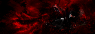
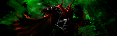 This One Has A Little Color Difference But Meh
  This One has A Little More Smudging And A Little Of Splatter To it
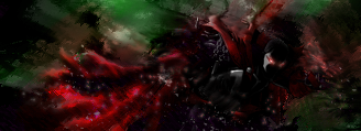
  My Final Result (Duh I Added My Name FTW
  )
)